

The ways we structure and visualize information are changing day by day. Data is growing at a rapid pace.
It is said that “data is everywhere,” and every human activity that uses technology generates more of it. Social media is a great example of how individuals are now generating huge amounts of new data every second, creating conversion and growth opportunities for businesses.
This generated information is enormously valuable and makes it possible to analyze trends and patterns and to use big data to draw connections between events. Thus, data visualization can be an effective mechanism for presenting an end-user with understandable information in real-time.
What is data visualization?
Data visualization is the process of acquiring, interpreting, and comparing data to clearly communicate complex ideas. It helps us to detect patterns within data, as well as trends and anomalies. It also is used by business leaders to aid decision making and enable them to analyze processes.
How does data visualization improve decision making?
Visuals communicate information faster than words — by one estimate, 60,000x faster. When engaging with media, whether it be social, news or your email inbox, think about where your eyes are drawn to first. What is most memorable to you? For most, the answer will be something visual as opposed to words. A study by Shift disruptive learning detected that after three days, analyzed subjects retained between 10% and 20% of written or spoken information, compared with 65% of visual information.
When applied to a business scenario, this speed of processing visual data means that when data is visualized, decision makers can gain valuable information from the data set much more quickly. This means they can gain more knowledge from their data, remember it for longer, and also see trends and patterns they may have otherwise missed.
Why is it important for a business to use visuals for data?
There are a few key points here:
- More value from data – Visualized data gives the viewer the most value possible from the data in the simplest format. Rows and rows of data can be condensed into one simple graph.
- Meaning from data – A graph can convey meaning that numbers or words could not communicate alone and presents it in a digestible and memorable way. This is arguably the real strength of data visualization.
- Increased efficiency – Time is money for most business professionals, so being able to glean needed information from data quickly is very important. Information can be assembled from a daily report in minutes.
- Real time data – Data is automatically updated at a set time interval, meaning users know that they are accessing the latest data from one source and not using outdated figures.
In light of mobile use and accessibility to apps, how important is data visualization now?
Data Visualization is about storytelling using visuals and technology. We design dashboards for desktops, tablets, and phones so that they can be accessed on the device preferred by the user.
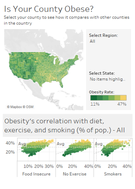
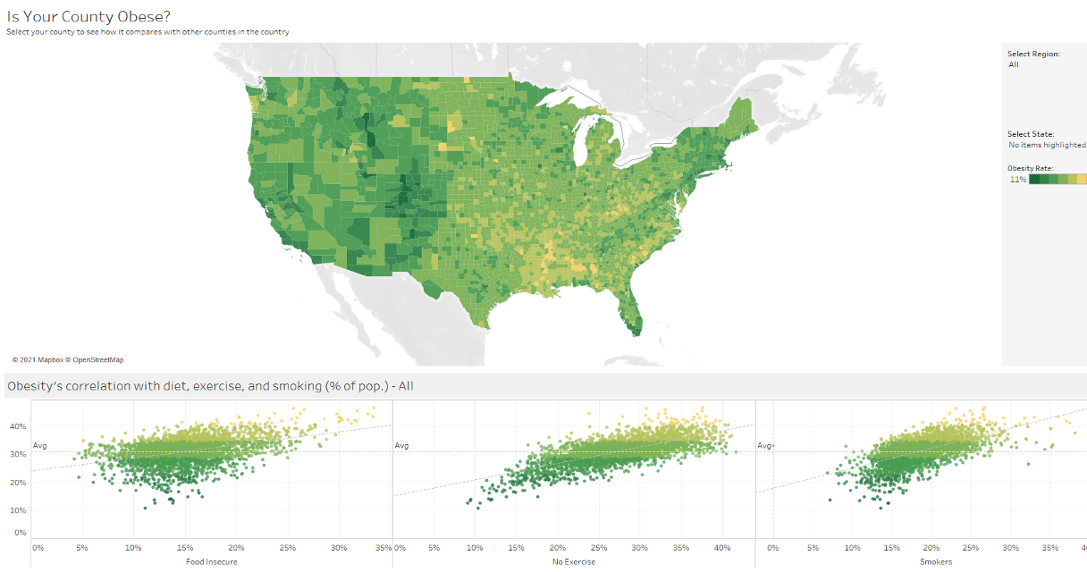
For example, this chart is developed in Tableau using obesity data. Hovering over a state on a map of the U.S., the user may see the obesity correlation with diet, exercise, smoking, or other information of interest. This information has been formatted for viewing both on desktop and mobile.
View on mobile
View on desktop
This visual allows the information to be understood faster by the viewer, without having to wade through figures, and it can also highlight comparisons more easily than numeric analysis. Visual content has already become the central tool of communication in social media via sharing photos, memes, gifs, etc. Therefore, employees expect to consume information in a visual form more than ever, making it increasingly more important in the workplace.
Chateaux’s latest visualization project
A recent project Chateaux completed is for a Higher Education client. We created an interactive Tableau dashboard to enable users to view key fundraising metrics with data about total donors, total donation amount, brackets, retention, participation, category, and other details with ease. Prior to our project, our client did not have any data visuals at all, they had to manually glean information from their data through analyzing Excel and Slate (a CRM popular with higher ed) reports. Now, they can access a wealth of valuable insights from their data in real time from an easily accessible Tableau dashboard.
Tableau was the visualization platform of choice for this project as chosen by the client. However, at Chateaux we have experience working across multiple visualization platforms such as Microsoft’s Power BI, Informatica, Qlik Q and more. So, whether you’ve got a particular solution in mind or are open to our suggestions, we can provide the solution that’s best for your business.
If you’d like to know more about data visualization or are interested in a project, get in touch today at [email protected].